Homes

Home Homes

You Won’t Believe What This Awesome Brewery Used To Be

As part of a massive neighborhood revitalization project in the Güemes district in the city of Córdoba, Argentina, this funky, open concept brewery was crafted from the shell of an old, broken down police station. What was once home to handcuffed criminals, on-duty patrolmen and stale donuts now serves locals cold, crisp lagers and plenty of interesting sights. The rennovation was led by Guillermo Cacciavillani, cofounder and creative director of Bar Makers.

In the architect’s words: “To transform the neighborhood, making it an engaging place, a living history, is the spirit that is revitalizing an area that for many years was marginalized in the urban scene of the city.” What better what to inject life and vigor into a neglected area than to provide a vibrant social gathering space as functionally appropriate and majestically pulled off as the Capitan Central Brewery?

captn brewery8The beauty in the juxtaposition of old against new is immediately noticeable, giving new life to an old shell.captn brewery1 Concrete benches and planters are used to reinforce the starkness of new material that plays on what was once there.captn brewery2 captn brewery3 Flashes of bright red punctuate interior circulation, both of people and the brewery equipment systems. captn brewery4 captn brewery5 A wall of delicately detailed windows open the space to an outdoor court, providing the interior with ample natural light.
captn brewery7

The courtyard sits adjacent to the massive concrete entry. The grand industrial procession pays homage to the police station that once stood here.

He Built A Romantic Forest Getaway For His New Wife In Just 6 Weeks For $4,000

$4,000, 6 weeks, and a whole lot of love was all it took for long-time carpenter Dave Herrle to design and build this tiny forest cabin. It’s a feat that is nothing short of astounding and one that invites skeptical curiosity as we ask ourselves: “How the heck did he do that?” For the price of a 12 year old Honda Civic Mr. Herrle has utilized found materials, salvaged parts, and a heaping spoonful of creativity to craft a little piece of heaven to call his own.

It was far from easy, but just what Dave and his fiancée needed.

tiny-house-4000-dave-herrle-1.jpg.662x0_q70_crop-scale

“For the longest time I had a hard time not being “normal.” I graduated from a small liberal arts college, got a desk job, and hated every minute of it. In 2007 my life changed dramatically after hiking the entirety of the Appalachian Trail. It was a gut check in life and I’m lucky it happened when I was 27 and not 67. My time in the woods gave me a perspective on the benefits of simplicity. It was in the woods that I promised myself that I wouldn’t spend a lifetime doing a job I didn’t enjoy.”

It’s a romantic sentiment, and one I’m sure we’ve all had when dreaming about when sitting in our cars on the freeway or staring blankly at a sprawling Excel spreadsheet. Dave took what he had and applied what he knew to make that dream a reality.

tiny-house-4000-dave-herrle-2.jpg.650x0_q70_crop-smart The structure uses large trees as the anchors of the foundation, eliminating the need for a costly concrete base. tiny-house-4000-dave-herrle-3.jpg.650x0_q70_crop-smart The footprint is small (only 10×14 feet), but highly functional. The couple added plenty of personal flair to make it their home.tiny-house-4000-dave-herrle-4.jpg.650x0_q70_crop-smart Like many tiny homes, going vertical is important for saving space. A lofted bed area sits over the ample kitchen.tiny-house-4000-dave-herrle-5.jpg.650x0_q70_crop-smart tiny-house-4000-dave-herrle-6.jpg.650x0_q70_crop-smart Dave continues to run his carpentry business, and has recently moved on to building inexpensive tiny homes for others, as well. Find out more about his work at Herrle Custom Carpentry.
tiny-house-4000-dave-herrle-8.jpg.650x0_q70_crop-smart

This Cabin Is Missing Something All Buildings Have, And It Rocks Because Of It

Who needs doors, right? That’s exactly what Nat Cheshire of Cheshire Architects said when he designed this pair of isolated structures off the coast of New Zealand. The cabins are completely open air and can be entered via a large square opening that steps you down into the main living area. The interiors are simple and clean, utilizing the warmth of native wood to tie the spaces to the adjacent landscape.

There is modesty and serenity in the way the buildings are anchored to the hillside. A quick glance would make them seem as if they were dark boulders jutting up and out of the grassy plains that carpet the surrounding countryside. They become a part of the iconic terrain rather than fight to visually overpower it. This harmony is echoed by the openness that results from having no doors. Protection might be limited, but the visceral experience is not.

1-doorless-cabin 2-doorless-cabin 3-doorless-cabin 4-doorless-cabin 5-doorless-cabin 6-doorless-cabin 7-doorless-cabin 8-doorless-cabin 9-doorless-cabin 10-doorless-cabin 11-doorless-cabin

11 Incredible Shipping Container Homes Show Life In A Box Isn’t So Bad

Shipping container buildings are as popular as ever due to their inborn novelty and natural stickability (LEGO nostalgia, anyone?). More and more people are flocking to homes that make use of their unique aesthetic, and it’s pretty easy to see why. They exude an inherent industrial machismo that’s not easy to replicate using traditional construction methods. Here are 11 such projects that take container homes to new and interesting creative heights.

1 | Kalkin Container Home

kalkin-1 Kalkin-2

Architect Adam Kalkin designed this home for himself utilizing a stacked wall of container shells as the focal component of the interior space. A hanger-like shell drapes over the containers and extends beyond them, creating towering ceilings and voluminous light. A few cheeky post-modern touches like the gabled window wall and adjacent brick chimney round out the design.

2 | The Painted Containers

Painted-1 Painted-2

Brazilian architect Marcio Kogan paints a beautiful, vibrant collage of recycled containers in this impressive expression of Latin American culture. Containers are stacked perpendicular to the primary axis of the residence creating a mural-like facade that dominates visually. It’s a tapestry that is as colorful as the people it protects and the place it inhabits.

3 | The Faux-Traditional Container Home

Faux-1 Faux-2

There’s no mistaking the container presence in this two-story home. French Architect Patrick Partouche does his best to bring around more traditional building vernaculars with the gabled canopy that perches atop the stepped back stacks of red containers. It the cans themselves, however, that truly spark interest in this project.

4 | The 40K Container Home

40k-1 40k-2

Designing a fully built-out container building that is cool, spacious, and affordable is not a feat to be taken lightly. Benjamin Garcia Saxe has done just that, transforming twin 40-foot containers into a luxurious contemporary house that defies economic logic. A popped up clerestory provides a sloped roof for maximum solar panel exposure, as well as an added aperture for natural light.

5 | The El Tiemblo Container Home

el tiemblo-1 el tiemblo-2

This sleek project emphasizes the horizontality that shipping containers inherently possess. A 40-foot container floats above the main living space, which is completely transparent and open to the landscape beyond. The project was designed by studio James & Mau Arquitectura and named for the Spanish city in which it resides.

6 | The Mojave Desert Container Home

mojave-1 mojave-2

Green roofs, open interiors and stark white container shells punctuate this ambitious project by Ecotech Design that aims to construct and environmentally bomb-proof shelter within a harsh arid climate. The project succeeds in both form and function, refusing to sacrifice a sleek design aesthetic for all of its eco-friendliness. This container home is a case study for what’s possible in eco-architecture.

7 | The Eco-Container

eco-1 eco-2

Speaking of eco-architecture! Cg Architectes designed this cross-shaped container home with the idea to use the containers as structural framework and experiment with contrasting exterior materials. The result is an eco-friendly and jaw-dropping conglomeration of pre-fabricated nirvana. The containers were shipped largely built-out, and carried the added-on materials, flat-packed, along with them.

8 | The Tiny Container Home

tiny-1 tiny-2

Following suit with the stacked, cross-shaped structure as the project above (albiet a tinier version) is this bite-sized container home from Jure Kotnik Arhitekt. The project is an exercise in small space functionality. In fact, there is no actual furniture in the home, only crime scene-esque outlines where the furniture should be. Imagination required.

9 | The Container Cabanas 

cabanas-1 cabanas-3

Get out the sunscreen and the inflatable aligator! These container cabanas park you feet away from poolside sun-bathing and are accompanied by some serious R and R. The cabanas can be rented out for a ‘camping’ experience that gives new meaning (or no meaning) to the phrase ‘roughing it.’ These bad boys go for about $1,100 a week, so get them while the sun-soaked metal container siding is hot!

10 | The Deployed Container Home

deployed-1 deployed-2

At first glance this contemporary and translucent home doesn’t appear to be a container project. A closer look at the WingHouse reveals the container being used as the backbone for the rest of the home that was shipped entirely within the built-out shell. It appears as if the container sneezed and out came a house, and I mean that in the coolest way possible.

11 | The Outdoor Container Home

outdoor-1 outdoor-2

In many ways this is what containers structures are meant to be: down, dirty, rugged and beat. This project situates a pair of containers on a dusty plot of land and connects them with an improvised shade structure, providing a shared exterior space that becomes the focal point of each unit. It’s a beach bum’s dream shack.

A Wartime Bunker Is A Good Place For A Home, Right? Right!

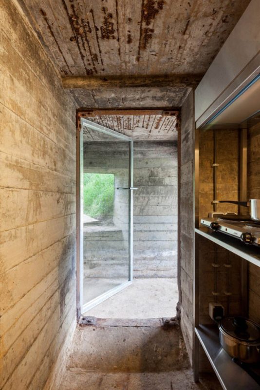
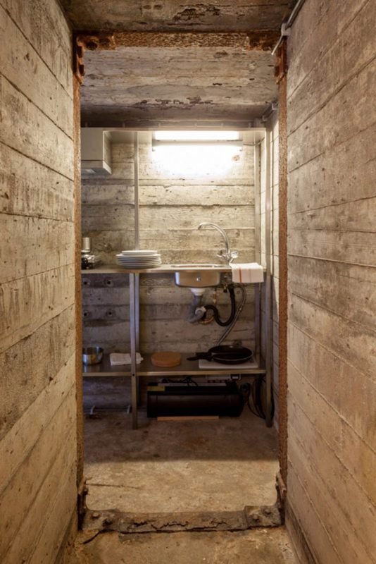
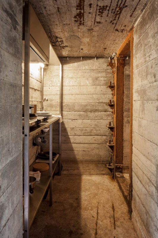
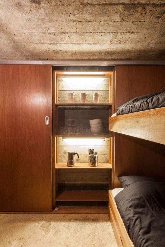
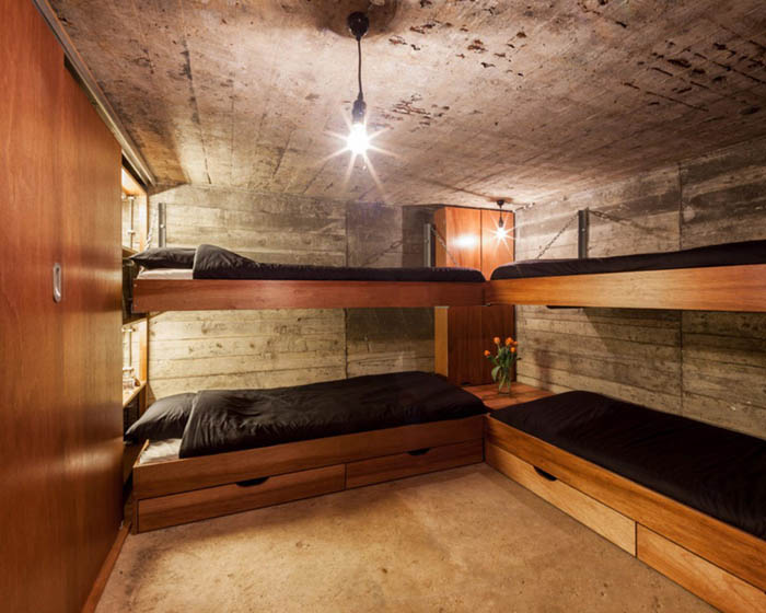
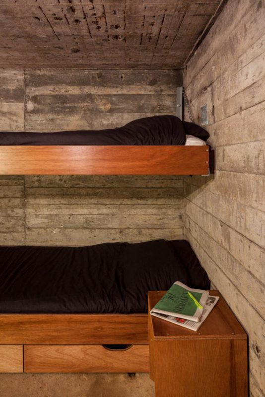
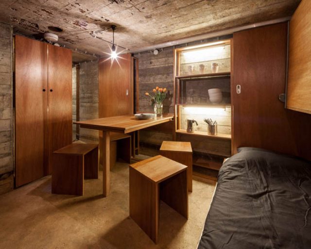
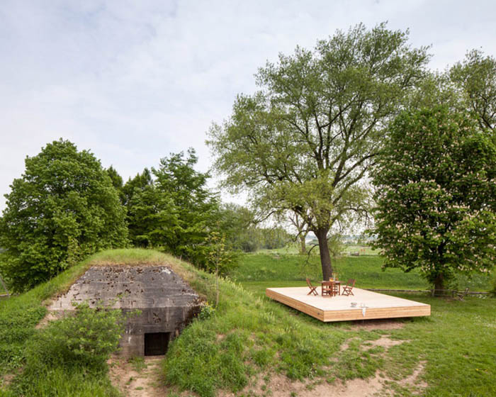
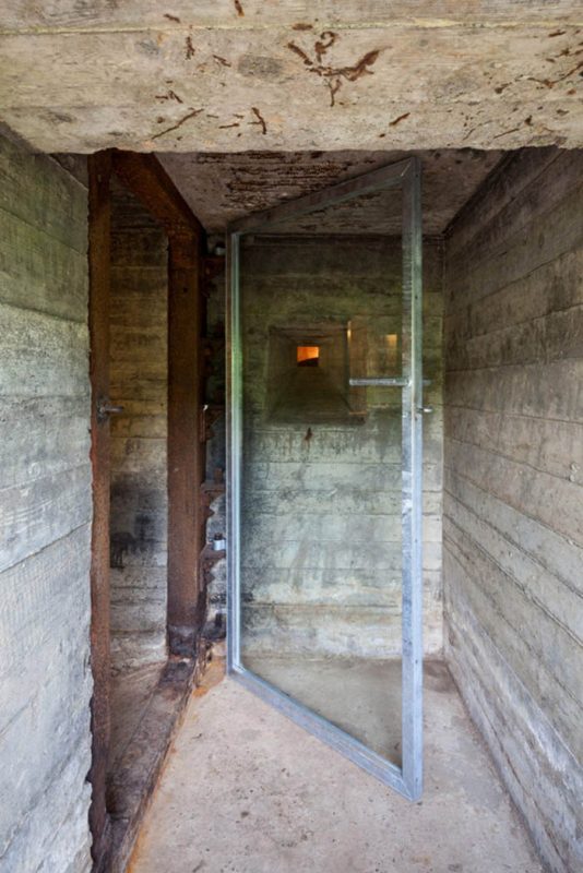
Netherlands based architecture firm B-ILD have transformed this decrepit, ancient war-time bunker into a cool, rustic-chic getaway. I’d be the first to keep my arm down in a show of hands of people who thought a dank old bomb shelter would make a good place to reside, but seeing this project might have just changed my mind. It’s an unorthodox adaptive re-use project that, at first glance, doesn’t have a lot going for it. Upon closer look, that’s exactly what the architect used to craft a majestic underground dwelling.

The ironic thing is that B-UILD’s additions are minimal and strategic, allowing the weathered board-formed concrete walls to define the aesthetic of the space. It’s a move that pays off in the end, turning the very thing that made the space desolate into what makes it shine. The bunker is small, occupying only 118 square feet of floor area. As a space saver, the sleeping area deploys barracks-style bunk beds; an appropriate nod to a common war-time building type.

war-bunker-house-1 war-bunker-house-2 war-bunker-house-3 war-bunker-house-4 war-bunker-house-5 war-bunker-house-6 war-bunker-house-7 war-bunker-house-8 war-bunker-house-9 war-bunker-house-10

Just Another Wooden Box In Portland? See What They Did Inside!

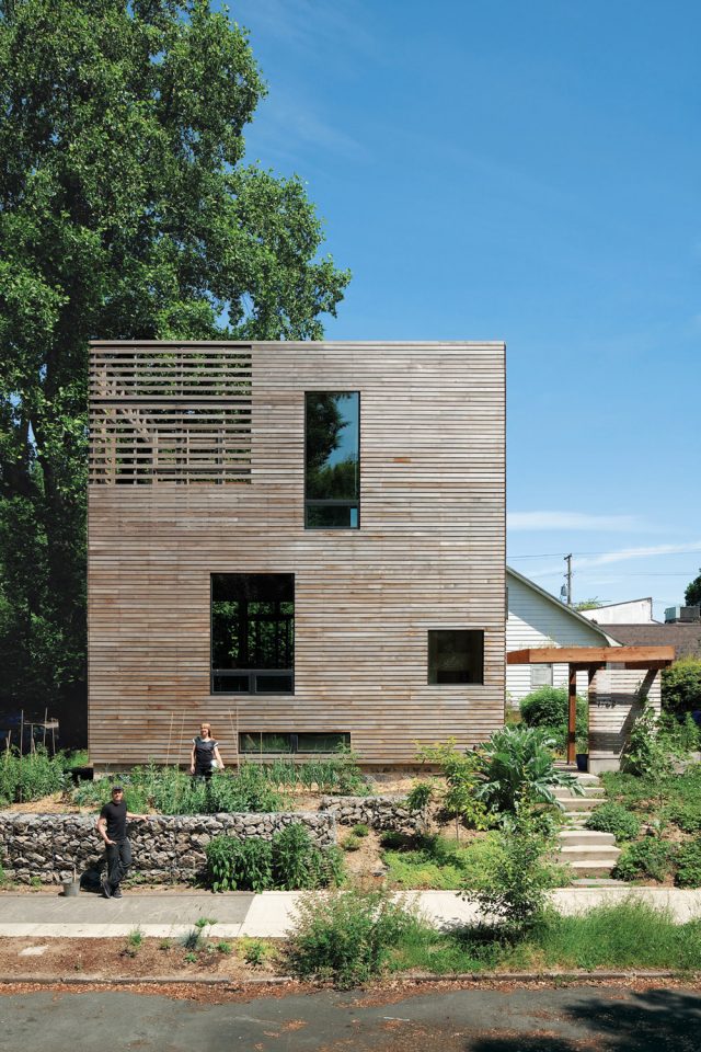
Portland, Oregon is home to many oddities and outliers. It’s a city made famous by the quirkiness of its people and places. Recently new homeowners and designers Katherine Bovee and Matt Kirkpatrick have embraced that culture and then some when they built their tiny, modern and altogether wonderful dream home. A tiny 50×50 foot corner lot in Portland’s Inner Southeast neightborhood was all they needed to think up this starkly clad wooden box, giving them a modest yet functional 704 square feet of living space.

The exterior is intentionally subdued and clean, allowing what happens on the inside to punch you hard right in the face (figuratively, of course).
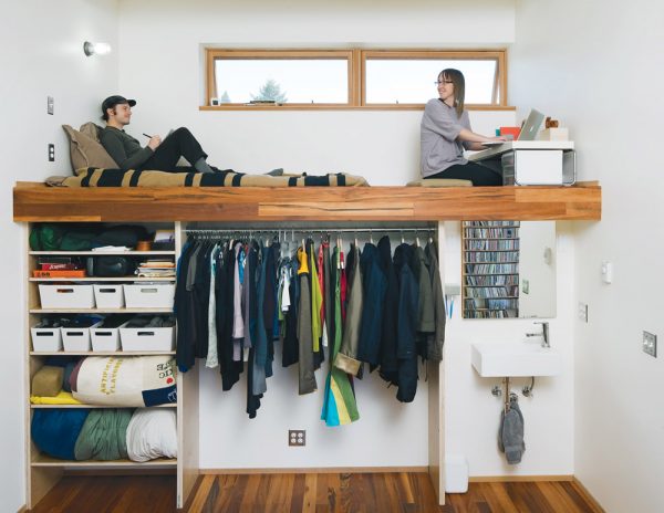
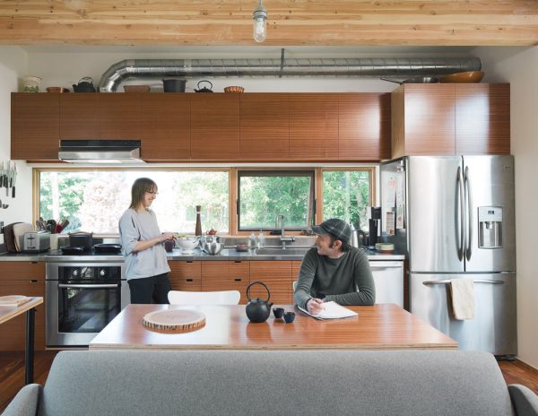
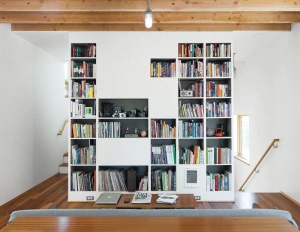
small-box-home-1 Take, for example, the bedroom. Yes, this is the bedroom! The daring couple has made creative use of a tall ceiling and an empty canvas to paint this little niche with style and flair. An exposed beam frames (visually and structurally) the bed loft that looks out to the neighborhood below. Naturally, this opens up the space below for storage, a closet, and even an exposed vanity. Did I mention it was functional?small-box-home-2 You would never guess that this is the kitchen of a tiny home. The space is luxurious and ample to say the least. Aside from all the light and space, the coolest feature is the exposed hood vent ducting that punctuates the industrial feel of the interior.small-box-home-3 Opposite the kitchen is this storage wall that holds everything from books and records to audio/video equipment. Katherine and Matt have modulated the openings with seemingly random opaque sections. It’s a visually interesting move that does well to hide otherwise unattractive elements like the heater vent. small-box-home-4


Image Credit: John Clark

5 Reasons The Legoland Hotel Is The best Vacation Option For Families

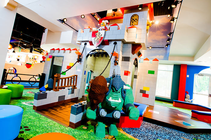
Have you ever wondered which hotel would be best for a family vacation with your two young children? The search is over. Just recently the much anticipated Legoland Hotel opened. The structure sits in Winter Haven, Florida and is styled to look like legos.

Let’s step inside, shall we?

legoland-in-florida-12

“From the minute you walk into Legoland Hotel, you can see it’s totally designed and built for kids,” said Legoland spokesperson Julie Estrada.

The hotel includes 2000 hand built Lego items, like a massive grunt guarding the moat, waiting about to smash you.

legoland-in-florida-03

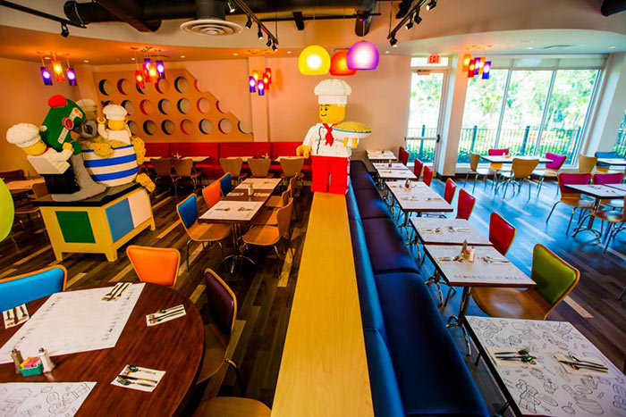
You can eat at Bricks Family Restaurant, where everyone can enjoy a healthy and fresh meal.

legoland-in-florida-04

Enroll the kids in a “Master Brick Building” and head to the pool to sip a cocktail.

legoland-in-florida-05

Vibrant scenes like this won’t leave your kid wanting for imagination or claiming they’re “bored”.

legoland-in-florida-06

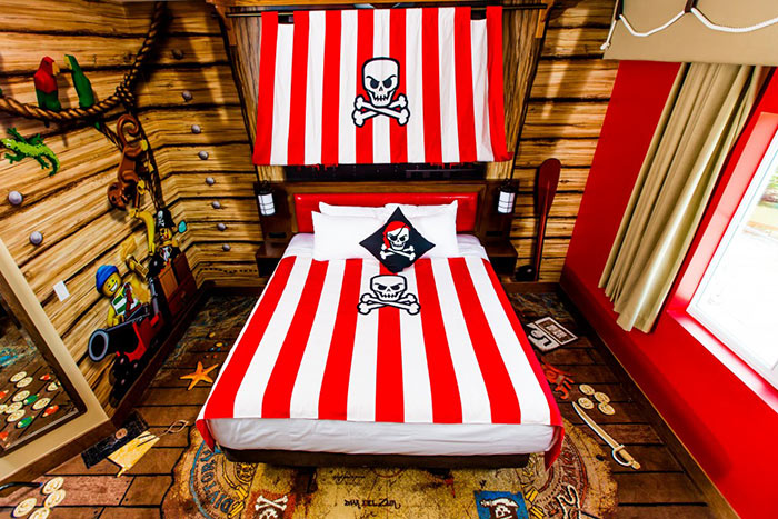
Just check out the bed! The kiddos won’t have any trouble hopping in there around bedtime.

legoland-in-florida-07

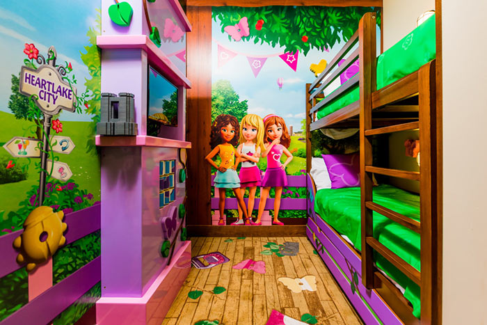
They have boys and girls options so there’s no arguing over who gets which.

legoland-in-florida-08 legoland-in-florida-09

Did we mention cocktails under the sun?

legoland-in-florida-10

Can’t you summon your inner child and go floating on a lego block?

legoland-in-florida-11

Brilliant Design Makes This The Most Beautiful Trailer Home We’ve Seen

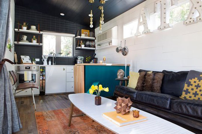
Don’t think you’d ever live in a trailer home? You might reconsider after laying eyes on this creative masterpiece. Located in Austin, Texas, this very unique home is actually made from two trailers allowing it to be moved easily. Though small, at just 400 square feet, it’s big on style thanks in part to the genius of interior designer Kim Lewis.

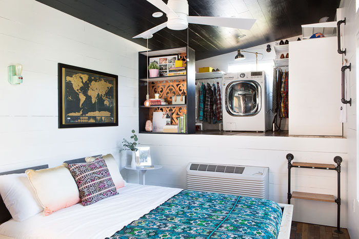
Clean lines, rich textures, and a balance of neutral white/black with splashes of color bring a ton of personality into the space. The salvaged flooring came from a 1960s home in Austin.

E4UmOVDCjEhx

The breezeway includes a pair of dog houses nested under the bench, and make for a cozy place for their two rescues to catch some Z’s.

VazD1D815flx

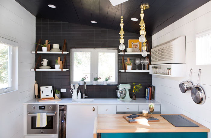
The slim kitchen features plenty of space to prep thanks in part to a movable island. Instead of a refrigerator, the owners use two small refrigerator drawers.

y9Uf2cTiFuex 2ariS3ZeRJnx

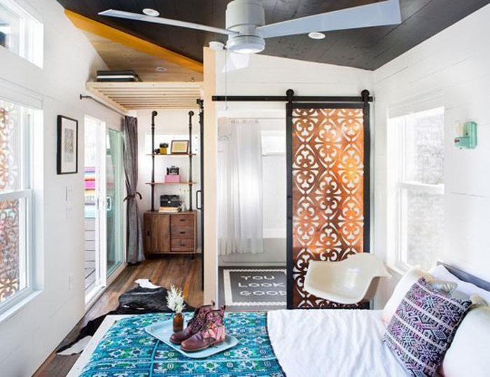
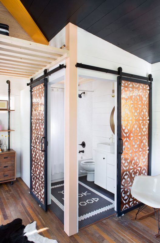
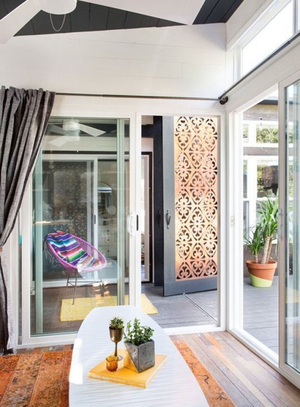
Slim barn doors made from perforated copper panels help save space and look amazing. The “You look good” tile pattern also adds a playful touch.

rjs3sSKod6xx

Behind the bed on the trailer’s gooseneck you’ll find a spacious closet that also includes a 2-in-1 washer/dryer.

skwKYT8G4zgx t5dl-pvwoAzxThe two owners of this home moved from Colorado to Austin to start their second urban winery business, and the home doubles as a tasting room. Thanks to the team at Tiny House Nation and the brilliance of Kim Lewis they were able to make their dream home a reality.

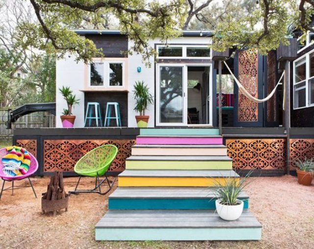
The curb appeal starts at the colorful steps and reaches every inch of the exterior. The spacious deck offers extra space for entertaining, and we love the hammock draped between the two planters. Based on the results we imagine they won’t have a problem impressing guests, wherever they decide to take their trailer home.

(Image credits: Lonny)

Tiny EcoCapsule Packed With Sustainable Technology Aims To Reshape Offgrid Living

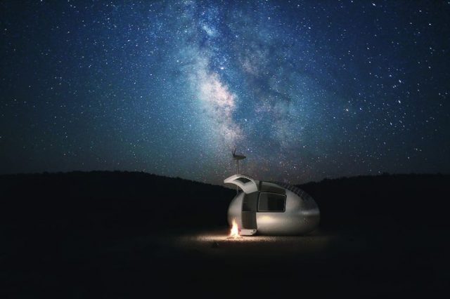
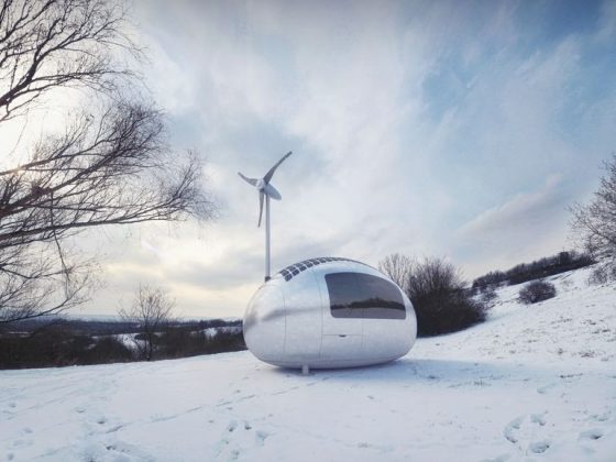
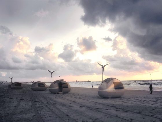
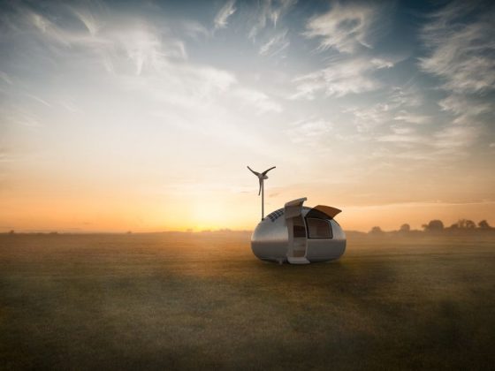
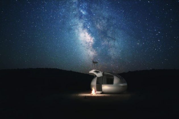
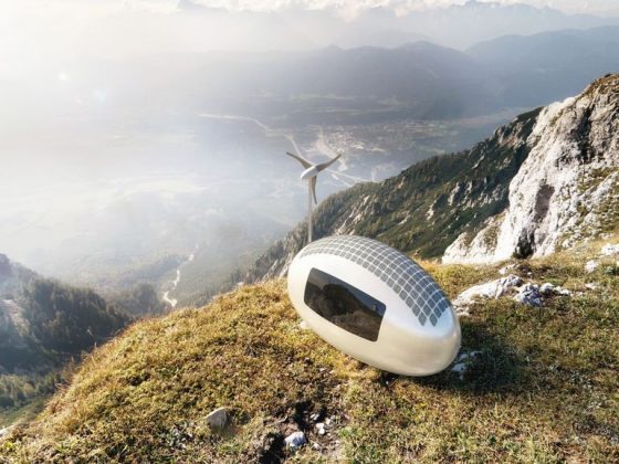
This egg-shaped capsule may look like something from outer space, but it’s being developed here on planet earth by Bratislava’s Nice Architects. The concept brings a micro shelter with an impressive array of sustainable technology that includes solar power, rainwater collection and filtration, and wind power. They plan to reveal a prototype in the next month, and make it available for sale later this year.

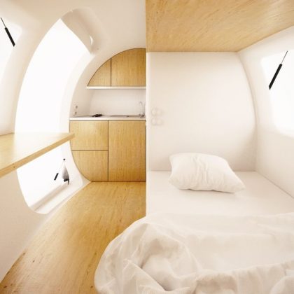
Inside you’ll find a cozy quarters of just 86 square feet. Designed to be easily transported, it can serve as a tiny house or office, and includes a toilet and shower, kitchenette, work and dining area, folding bed and storage both inside and out. Perhaps most exciting is the built-in technology it comes with, including a 28 square foot solar array and a silent 750 watt wind turbine.

Details are still fuzzy, though we expect to learn more once the firm makes its reveal on May 28 at the Pioneers Festival in Vienna.

Old Stone House Once Used For Livestock Now Provides A Comfy, Modern Retreat

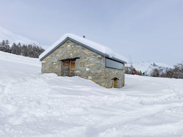
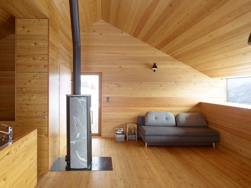
When you look at this house in the Swiss Alps chances are you don’t envision a terribly cozy place to shack up. Perched at 5,000+ feet elevation, the ancient stone cabin was once used to house animals that roamed the hillside. Today it serves a very different purpose thanks to the work of Sabioz Fabrizzi Architects, who restored it into a beautiful place to stay they call the Gaudin House.
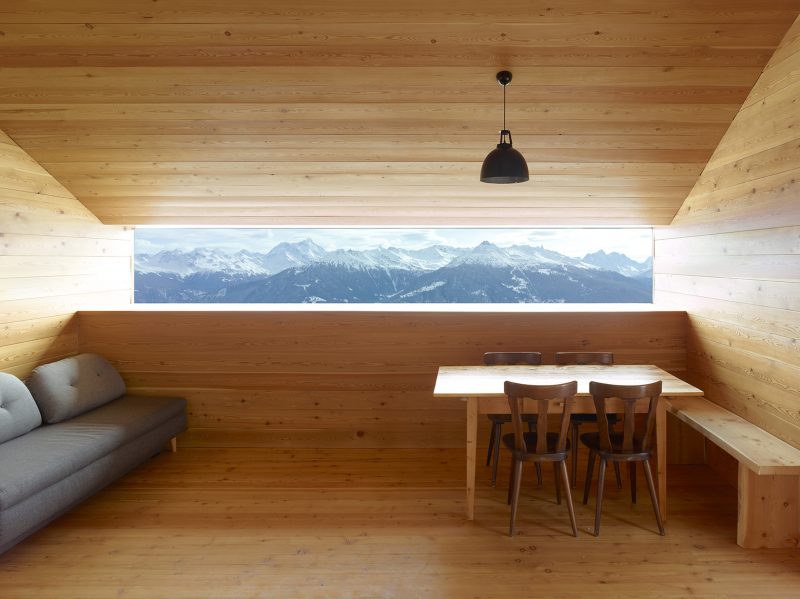
Gaudin-House-Small-Cabin-Savioz-Fabrizzi-Architectes-Switzerland-Window-View


They maintained the original character of the structure, retaining the thick stone walls while bringing the interior a completely new look. The inner walls are covered in larch and large panoramic windows allow guests to fully appreciate the mountainous surroundings.

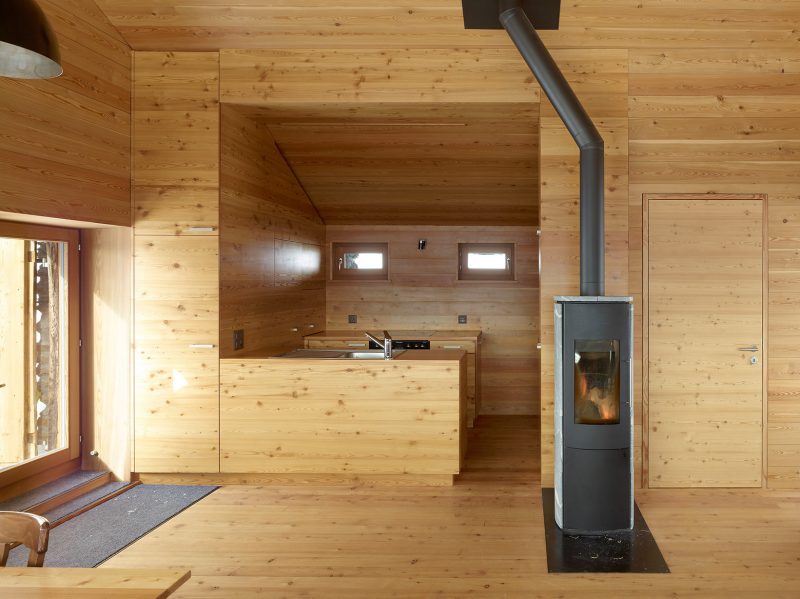
Gaudin-House-Small-Cabin-Savioz-Fabrizzi-Architectes-Switzerland-Kitchen


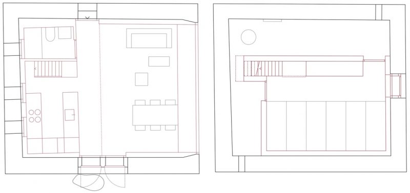
Split over two stories, the Gaudin House now has 800 square feet of living space.

Gaudin-House-Small-Cabin-Savioz-Fabrizzi-Architectes-Switzerland-Living-AreaGaudin-House-Small-Cabin-Savioz-Fabrizzi-Architectes-Switzerland-Floor-Plans

Photos: Thomas Jantscher