Unusual Designs

Home Homes Unusual Designs

A Creative Solution For Homeless Housing, Or Just A Pipe Dream?

Homelessness remains a worldwide issue, and in nearly any city or town with a prevalent number of homeless, you’ll find a number of solutions in place. The most popular being a shelter. But what if there was another solution?

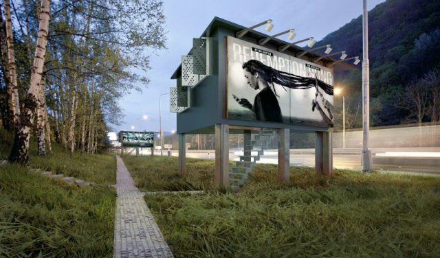
DesignDevelop-Gregory-Project-Billboard-Houses-Homeless-Housing-Exterior-

This concept from DesignDevelop might seem a little far-fetched at first, but the fact remains they are generating a discussion about the issue, regardless of whether or not their solution is viable. What is their solution you ask? The design firm created a 178 square foot triangular-shaped home with sides that double as a billboard.

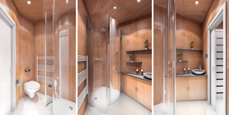
DesignDevelop-Gregory-Project-Billboard-Houses-Homeless-Housing-Bathroom-

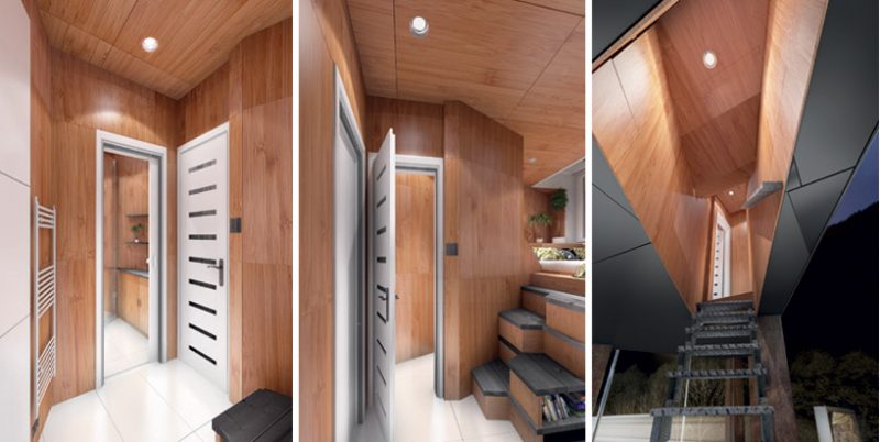
Step inside the dwelling and you’re met with a decidedly luxurious looking design. We have to wonder what sort of maintenance would be required should something like this actually serve as a home for the homeless.

DesignDevelop-Gregory-Project-Billboard-Houses-Homeless-Housing-Bedroom-and-Living-Area-

The “live-in” billboard is raised off the ground, and is accessible via a small staircase. The only visible hint of what’s sandwiched between the billboard is the rear of the structure, which has a few windows.

DesignDevelop-Gregory-Project-Billboard-Houses-Homeless-Housing-Entrance

There’s a bathroom, shower, toilet, and a raised bed with storage underneath. You’ll also find a galley kitchen and a study area opposite the bed.
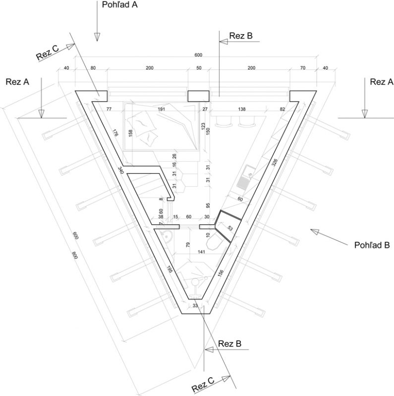
 

DesignDevelop-Gregory-Project-Billboard-Houses-Homeless-Housing-Floor-Planes

While the concept is pretty cool, we have to imagine that living next to a highway would itself violate most zoning laws. Regardless, we comment DesignDevelop for the thought behind their billboard home.

Photos courtesy DesignDevelop

This Unique “Ultra Green” Building Is Covered In A Green-Wall Exoskeleton

Brazilian architecture firm Triptyque have designed an office building in Sao Paolo that not only collects rain water, but utilizes a sophisticated filtration and delivery system to irrigate naturally insulating green walls. A maze-like network of water pipes snake up and down the building’s facades, fitted with misters that provide the living walls with freshly recycled rain water.

The project is an ecological experiment aimed at challenging how society deals with water – how it can be collected, recycled, and redistributed with little need for waste or run-off. In addition to the green wall system, a series of planted roofs further mitigate the structures environmental footprint. When the misting nozzles are on full tilt, the building is enveloped in what appears to be a stationary cloud, reinforcing the issue of water conservation in both function and aesthetic.

In 2010, the unique green features won this office building the ‘Built Environment’ award from the Zumtobel Group.

Seattle’s 5-Foot-Wide “Spite House” Up For Sale

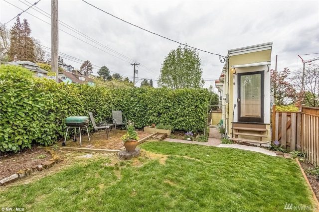
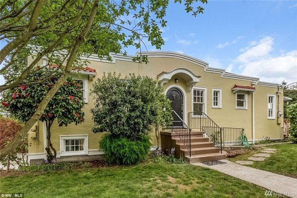
2022 24th Avenue E of Montlake in Seattle, Washington seems like any other tiny home recently inspired by the Tiny House Movement. The home is 850 square feet, barely five feet wide, is currently on the market for $519,000 – and is in the heart of local legend.

Montlake

In 1925, a judge presiding over a vicious and bitter divorce ruled that the husband would keep the marital home, and his wife was awarded a sliver of land just in front of the home. To add insult to injury, the husband offered what was to her an unacceptably low offer to purchase the land. As a result, she began construction of what has now come to be known as “The Montlake Spite House” by the community. She even went as far as to paint the wall facing their formal marital home black as to further obstruct his view!

In this photo, you can see just how narrow this house really is!

Montlake1

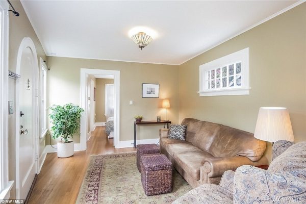
A view of the living room. While it may be too small to hold a television set, it has plenty of space to seat guests comfortably!

Montlake4

The master bedroom. Believe it or not, this home has two bedrooms, and two full baths!

Montlake2

The place where you really begin to feel cramped may be the kitchen – but it’s worth it just to be able to look at your ex-now-neighbor through the kitchen window with a look of triumph!

Montlake3

Montlake5

There’s even a two-car garage!

Montlake6

She proved her point to her ex-husband, and since then the house has only ever steadily increased in worth: The Montlake Spite House sold in 1996 for $140,550; $235,500 in 2000; and $375,000 in 2014. How much of a factor the notoriety and legends surrounding the of home plays into that increase is up for speculation.

Organic Inspired Nautilus Seashell Home Is Something To Behold

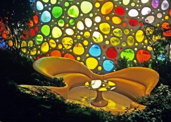
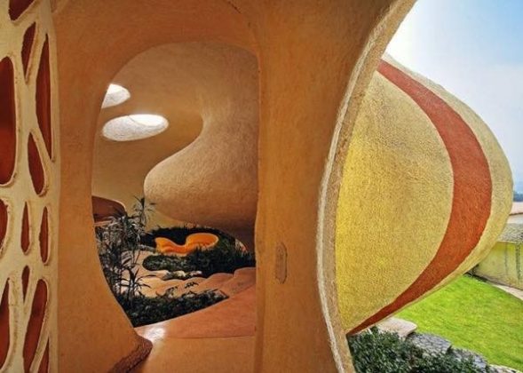
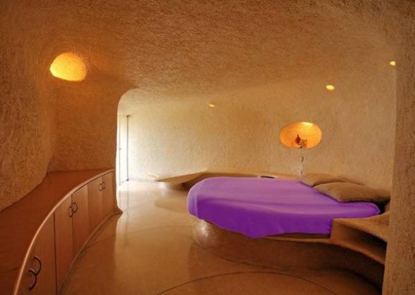
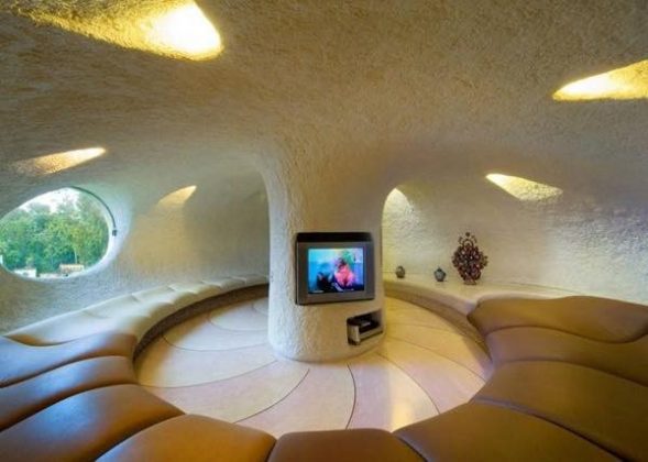
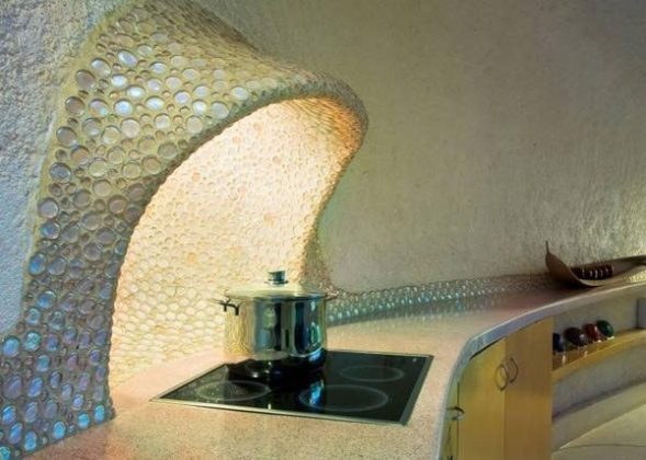
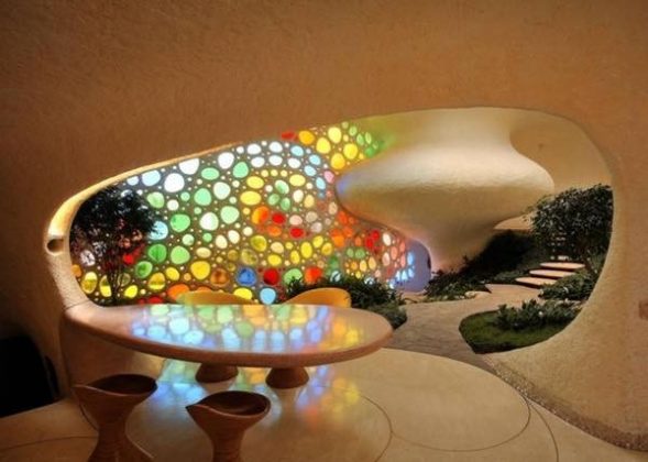
Ever wonder what would happen if Arial of The Little Mermaid became an architect? Neither have I, but I imagine she might design a house that looks something like that. In reality, this wasn’t designed by a mermaid but rather by Javier Senosiain from Arquitectura Organica, a Mexican firm that specializes in unique creations like the one you see below.

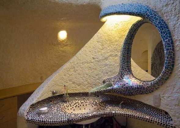
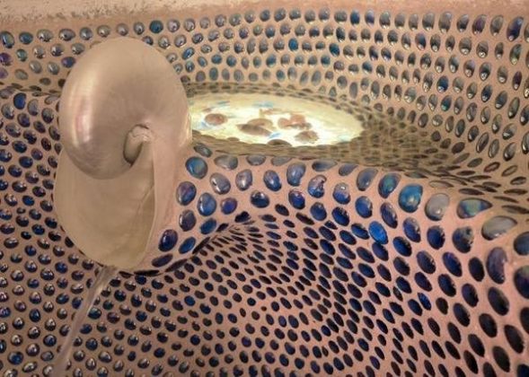
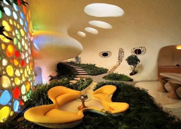
While it looks quite extraordinary from the outside, when you step inside the home you instantly notice the barrage of bright colors spilling through the custom stained glass window. It’s simply gorgeous. The whimsical layout was designed to bridge the gap between architecture and nature, hence the shell shape. Inside the home you’ll find lots of curved edges and plants sprouting between organically shaped seating areas. Every room in this home brings some magical aura with it. Overall, it represents one of the most unique homes we’ve ever seen. What do you think?

You’ve Never Seen A Pre-Fab Cabin Quite Like This

Pre-fabricated architecture has taken the world by storm in the last decade, and it’s easy to see why. Build a house in a factory and piece it together on a plot of land hundreds of miles away, all in a matter of weeks? Count me in. There are, however, limitations to this type of construction, forcing architects to adhere to a box that will fit neatly on the back of a flat bed truck.

The thing about Swedish designer Torsten Ottesjö? He isn’t really into limitations.

Ottesjö works for Cargo Collective, who aimed to take pre-fab to the a-typical limit. They ended up with an organic, curvilinear form that flies in the face of everything we’re used to seeing in factory-built structures. The cabin is inspired by an abundant native fish, and consists of a single open space that slithers its way through the landscape. Local wood species are draped inside and out, further tying this one-of-a-kind modular building into it’s final resting place.

A Good Home Is Made Great With An Up-Cycled Spartan Trailer

A well-designed home with large open spaces, contemporary materials, and plenty of natural light can be a very good thing. But sometimes, there needs to be something truly unique as a focus for the home to be considered great. This is the notion architect Andrew Hinman took to heart when he designed this Texas home around a re-used Spartan Trailer.

The shimmering silvery cladding of the now immobile recreational tube is presented prominently in the composition of the home. Functionally, it operates in much of the same way it always has, only now it acts as a focal appendage to the sleek glass and steel enclosure that engulfs it. The architect wanted to celebrate the use of a recycled component in the context of a well-crafted modern structure.

spartan-house-by-andrew-hinman-architecture-1 A massive shed roof towers over the trailer and the interior space adjacent to it. A large sun room occupies this space, acting as an extension of the living quarters of the trailer.spartan-house-by-andrew-hinman-architecture-2 An exterior soaking tub ties the home in with it’s desert surroundings, emulating the feel of camping that the trailer once embraced.spartan-house-by-andrew-hinman-architecture-3 spartan-house-by-andrew-hinman-architecture-4 The space adjacent to the trailer opens up to the sunny desert vista.spartan-house-by-andrew-hinman-architecture-5 Looking back at the trailer from the interior, it maintains its original aluminum sheen.spartan-house-by-andrew-hinman-architecture-6 As you can see, stepping inside the trailer is like stepping through a portal into the past.spartan-house-by-andrew-hinman-architecture-7 The rest of the home feels quite new and contemporary, sitting in contrast to the retro presence the trailer provides.spartan-house-by-andrew-hinman-architecture-8 spartan-house-by-andrew-hinman-architecture-9 spartan-house-by-andrew-hinman-architecture-10 spartan-house-by-andrew-hinman-architecture-11 spartan-house-by-andrew-hinman-architecture-12

Photos by Paul Bardigjy.

20 Striking Images Of The Beautiful Ruins of Detroit

Detroit, MI. Once one of the worlds great cities. Born from the automobile industry and fueled by the WW2 war machine, Detroit rose to socio-economic prosperity at the turn of the 20th century. This period of wealth survived for decades until economic tragedy brought the city to its knees. Once an American treasure, Detroit has been largely abandoned and reduced to a tragic ruin of crumbling concrete and twisted steel.

Photographers Yves Marchand and Romain Meffre have found beauty in that tragedy. In their book The Ruins of Detroit, they explore the far reaches of the rubble, effectively telling the story of the city’s demise. The images are striking, and show us how easily and swiftly our empires can fall.

Young Couple Used Recycled Windows To Build This Incredible Glass House

Chipped paint, faded finishes and dingy old glass didn’t stop this couple from up-cycling an array of discarded windows and salvaged wood into unbelievable DIY home. The unique facade is the focus of a home that they build entirely out of recycled materials – a project that cost them only $500!

Photographer Nick Olson and designer Lilah Horwitz designed and built this low-cost cabin retreat among the picturesque West Virginian mountains. They aimed to construct a space that would act as a vessel to fuel both of their creative endeavors. It had to be unique, inspiring, and above all else – cheap.

“We were able to make it a reality because we are first artists and creators. We had to be resourceful to do it cheaply,” explained Nick.

A nearby abandon barn provided plenty of charm and salvaged materials to draw design cues from (not to mention free resources). While the cabin isn’t their primary residence, the couple frequents it as much as they can to recharge their creative batteries and marvel at the collective potential of their efforts.


Disgusting Old Cave Turned Into A Seriously Luxurious Home

23-year-old Alexis Lamoureux’s story is a familiar one. The French national from a picturesque French village on the banks of the Loire River was left scrambling after losing his bartending job at a struggling local bar. He and his girlfriend faced few options pitted against soaring housing prices that plagued many European nations.

1_cheap-cave-tiny-house

Where Alexis’ story goes from there? Not so common. An opportunity presented itself in the form of what some would describe as a troglodyte home that was once owned by his great aunt. Call it what you will, it’s basically a decrepit old network of hallways and rooms carved into the side of a mountain. In other words, it’s a cave. Add in 25 years of neglect and a heaping pile of garbage and you’ve got yourself the situation Alexis found himself in after purchasing the home from auction for the towering sum of 1 euro.

The transformation that took place next is nothing short of astonishing as you can see.

Sleek Forest Home Where The Forest Is Actually In The Home

Building a home often means flattening the plot of land set to be developed, effectively destroying what made the site interesting in the first place. However, when trying to design something truly beautiful we find that architecture can only be as good as the land it embraces.

Meet the Casa Corallo by Guatemalan based architecture firm Paz Arquitectura. Rather than uprooting the trees that natively inhabited the building site, they literally designed the home around the natural vegetation. Towering trees flank, loom, and even pierce through the home in a way that blends existing and new in elegant symbiosis.
casa-corallo-modern-house-architecture-1 Two trees frame the entry of the mostly concrete home. The harsh material was used to provide ironic contrast between natural and man-made.casa-corallo-modern-house-architecture-2 casa-corallo-modern-house-architecture-6 The home spill down the natural slope of the hillside as a stone path melts together with low brush.casa-corallo-modern-house-architecture-8 The interiors are highlighted by tree trunks that climb up through the floors. In many cases, the location of the trees dictated the spatial organization.
casa-corallo-modern-house-architecture-9 casa-corallo-modern-house-architecture-10 casa-corallo-modern-house-architecture-12 casa-corallo-modern-house-architecture-13 casa-corallo-modern-house-architecture-16

While the home is large and imposing, the choice to involve the trees so prominently in the design speaks to the sensitivity the architect had towards the land.